The hometowns of Binghamton University students, the population of Broome County and the frequency of calls to Harpur’s Ferry all have something in common — they’re all data, and they can all be visualized.
This concept of data visualization is the subject of the new exhibition in Glenn G. Bartle Library. The display, located across from the student service desk, is broken into two sections. One features design-driven data, including the works of British data journalists David McCandless and Mona Chalabi and Italian information designer Giorgia Lupi. The other section shows the works of American statistician Edward Tufte, information technology innovator Stephen Few and German designer Lisa Charlotte Roth.
Data visualization, or infographics, is the use of graphic visuals to present data in a way that makes it more comprehensible.
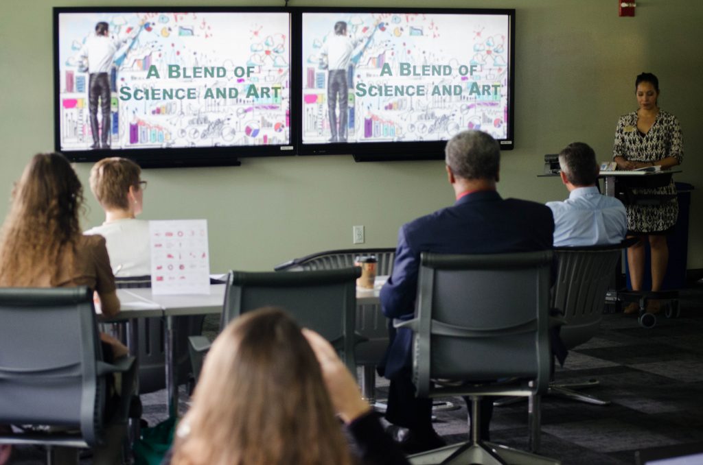
Kirsten Pagan, B-Engaged platform coordinator and assessment analyst, and Zoraya Cruz-Bonilla, data research analyst, both work in the office of Student Affairs Assessment and Strategic Initiatives and created the exhibition together. On Monday, they presented on their idea, discussing infographics, their importance and their risks.
“I wanted to highlight what data visualization is and lay a foundation for what it is now, where it could go next and also for people to see what could possibly go wrong in their efforts, whether that’s intentional or unintentional,” Cruz-Bonilla said.
According to Pagan, a central point in the exhibition is that infographics make data more accessible to the general population. They aimed to do the same in their project, presenting some of the works with QR codes, which viewers can scan using their phones to learn more about the exhibition.
“A picture is worth a thousand words,” Pagan said. “It says a lot more in that one image than saying, ‘This represents the population of those who are under [a certain age].”
Presentation attendees discussed books by several of the exhibition’s data researchers, including “Signal: Understanding what Matters in a World of Noise” by Stephen Few, “Envisioning Information” by Edward Tufte and “Dear Data” by Giorgia Lupi and Stefanie Posavec. In addition, attendees were given handouts with a list of online and print resources for making and understanding infographics.
Rachel Turner, a member of the Bartle Library Exhibits Committee and a cataloging librarian, said Pagan and Cruz-Bonilla’s proposal was originally chosen because of its relevance to Bartle Library’s mission.
“As a library, we’re always trying to get people to learn more about and from information, because we have books sure but it’s about more than that,” Turner said. “We’re trying to teach people how to use databases, understand info and data they might see rather than just look at it and moving and so data visualization was right up our alley. It was a way for an outside source to come in and in a beautiful way show students you can look at data and understand it or if you had data you want to show, show it in a way that people would want to look at it.”
Through supplementary presentations, Pagan and Cruz-Bonilla are aiming to extend that impact. Hehuanyu Li, a senior majoring in biology, said the exhibition provided valuable insight for those who conduct research.
“I think it’s very relevant to college students and anyone doing research,” Li said.


