For those of you who don’t have an iPhone or haven’t heard it from all of your friends, Apple released the new version of its mobile operating system, iOS 7, which is chock-full of fresh designs, revamped interfaces and new services. The most prevalent and noticeable change is the aesthetic redesign of the user interface. Gone are the tacky skeuomorphic apps — iOS 7 is more colorful and more minimalist. The calendar app is relaxed, cleaner and easy to scroll through. Safari took some notes out of Chrome’s book, making searching the Internet a more streamlined and aesthetically pleasing process. The notes app no longer looks like a yellow pad. For those new to the iPhone, they’re in for a whole new experience.
But how does this design pan out in public approval? Are the colors too vibrant? Did Apple change too much or too little?
In a campus-wide survey, Pipe Dream gave students the opportunity to voice their opinion regarding the recent changes to iOS. Out of the 163 students polled, 149 people reported using an iPhone, with 141 people reporting already having upgraded to iOS 7. Out of the eight people who haven’t updated yet, two people stated that they plan on upgrading while six stated they were refusing the upgrade because they simply didn’t like the new interface. Despite the few outliers, the trend is definitely toward upgrading (just in case you’re one of those people who likes to be in the herd).
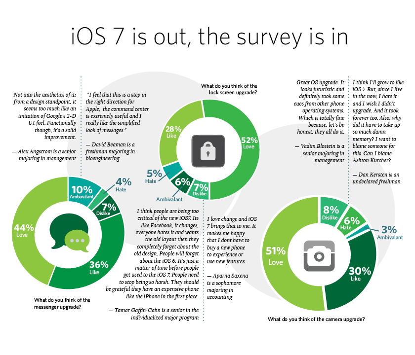
iOS 7 features redesigns of the stock apps that come pre-loaded with the iPhone. Features like calendar, camera, photos, music, Safari, mail, settings, Game Center, iTunes and App Stores, Newsstand, phone, messages, as well as utilities like Siri, notifications center and the lock screen, all got complete facelifts. As far as the numbers are concerned, most people reported at least liking, if not loving, the new redesigns, especially concerning the camera, photos, music, Safari, phone and messages apps. The major outliers that people were mostly ambivalent about include Newsstand, Game Center and iTunes Store. This isn’t surprising, considering that they are arguably the least-used apps in everyday life. Newsstand doesn’t offer the full sweep of titles available on iPad, and Game Center still seems inessential.
In addition to the redesigns, Apple also added several new features to the iOS, including camera filters (pre-loaded!), multitasking, control center (with flashlight), AirDrop and the ability to use dynamic and moving wallpapers. The majority of people agreed that these new features were useful to them, with the exception of AirDrop and dynamic wallpapers.
AirDrop, new to iOS, allows iPhone users to send files to other iPhone users over Wi-Fi or Bluetooth instead of an intermediary, like email or Dropbox. However, the utility is limited because it only works iPhone-to-iPhone. It isn’t compatible with Macintosh computers. Also, for those still using the old iPhone 4S from two years ago, the iOS 7 update doesn’t even come with AirDrop.
The dynamic wallpapers, while also new to iOS, didn’t bode too well in the survey either, with 52 percent of people reporting that it wasn’t useful to them. The probable cause here could be that the stock of dynamic wallpapers that came with the update are pretty basic and limited.
The majority of the criticism of the new iOS 7 is concerned with the new aesthetics, among reports that the operating system is causing shorter battery life in old phones (iPhone 4S and prior). Several survey respondents critiqued Apple for taking a more Android look to its systems.
“Not into the aesthetics of it [iOS 7] from a design standpoint, it seems too much like an imitation of Google’s 2-D UI feel. Functionally though, it’s a solid improvement,” wrote Alex Angstrom, a senior majoring in management, in his survey response.
Change can be scary, but get comfortable with a system; you need to get used to it first.
“I think I’ll grow to like iOS 7. But, since I live in the now, I hate it, and I wish I didn’t upgrade. And it took forever too. Also, why did it have to take up so much damn memory? I want to blame someone for this. Can I blame Ashton Kutcher?” wrote Dan Kersten, an undeclared freshman.
Given time, when iOS 7 doesn’t seem so new and intimidating, it’s likely that many of its critics will come around and just accept the new system. The new iOS is here to stay, at least until the next UI redesign. Still, it’s hard to adapt to a completely new look of an item you probably use constantly, all day, every day. Despite the criticism, 85 percent of people reported that they were at least somewhat likely to recommend iOS 7 to a friend (46 percent very likely, 39 percent somewhat likely), with a mere 5 percent of people stating that they’d recommend against it.
The design world is moving in a new direction. Things are going to change, from software to hardware. Apple’s iOS 7 is clearly a sign that the company is trying to stay relevant in a world where Google and Android have the advantage.


