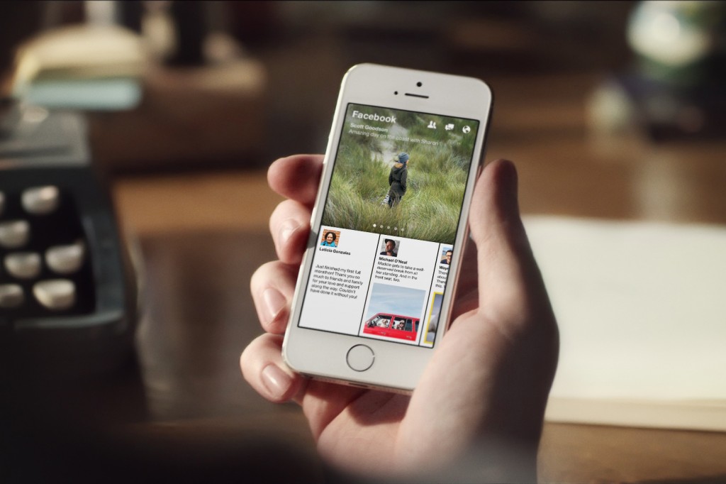
It doesn’t matter how hip you think you are, it’s hard to argue against the fact that Facebook is at the crux of the social media industry and our lives. While Facebook has moved to smartphones, the app can sometimes feel more like something to use during a boring lecture rather than as a social necessity. And as much as it changes its design, it still seems like you’re seeing the exact same content over and over again (although they did add #hashtags). That is, until Paper.
If you’ve been following the tech world recently, everybody is talking about Paper, a new free iPhone app from Creative Labs, a division of Facebook, that was released last week. With a refreshing new user interface (UI), Paper doesn’t just make Facebook look better — it revolutionizes the experience entirely. It’s important to note how well Facebook works in the new subtle UI. Instead of one long vertical stream of “news” as the old Facebook delivered, Paper presents fresh news from a variety of sources and streams. The shift is definitely away from your friend’s “important” status updates and last night’s Tom & Marty’s pics and instead, focuses on the news and pop culture side. Paper brings you to a customizable assortment of themed pages called Sections, such as the “Headlines” section that shows all the latest news, or the “LOL” section for the people looking for the periodic chuckle. Paper lets you customize which sections appear and in what order you see them. From each page you can then re-share or repost the myriad news articles and photos to your own wall. In essence, Paper hopes to be your first and only stop when you’re trying to keep up with (and share) current events and cultural trends.
Paper greatly improves the way you view online mobile content with its in-app mobile browser. When you click on a link or an article shared by one of your friends (or in any one of the sections), you swipe up, emulating the feeling of opening a letter. Instead of sending you back and forth to Safari, Paper keeps you inside the app, offering a much more natural experience with reading online context. When you’re done reading, you simply swipe down (or pinch in), returning you to the previous screen. From there you can like, comment, share or simply swipe to the next post. Also, as of right now, Paper does not host any ads, meaning it’s one of the few ad-free Facebook platforms out there.
Everyone who uses Paper will tell you the same thing: It’s not just Facebook. Paper offers a fresh new experience that looks to change not only the look and feel of Facebook for the iOS platform, but also the utility of the social media platform at large. With Paper, Facebook has effectively outdone its own iOS app. The most notable thing that didn’t change in Paper is Facebook Messenger. For users of the current Facebook app, they will notice that messaging in Paper works in very similar ways. For those who use Facebook primarily as a messaging platform, one might be more inclined to use the Facebook Messenger app for their day-to-day use. However, for those looking for a fresh, new Facebook experience with a clean and intuitive interface, Paper is definitely an iPhone app worth checking out.


